July 19, 2019
Tylko x Ana Popescu – Revisiting the Midcentury
Continually on the hunt for inspiration, we sit down with some of our favourite creatives to discover what makes them tick. First up, Ana Popescu, an artist and illustrator based in Vienna.
With a busy career combining small-scale personal projects with commissions from the likes of Rimowa and Canal+, her candy-hued twist on the strong, modernist lines of mid-century architecture have quickly become her much-sought after trademark. Growing up in Romania, Ana developed a passion for the Bauhaus-influenced structures that appeared in the post-war era. Now, reimagining this heavyweight architectural style through a dreamlike lens, this ambitious artist has clearly hit on a winning formula.
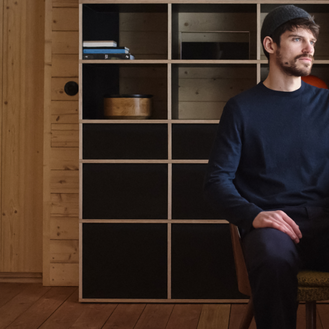
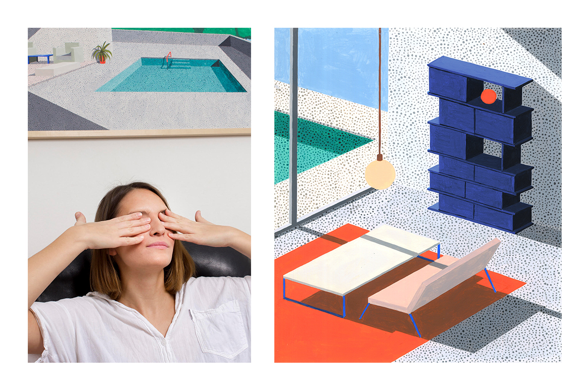
Lending her vibrant palette to the Type02, we set Ana the challenge of applying her singular vision to 3 pieces of furniture, with three distinct and eye-catching environments to match. To find out more, we caught up with Ana to talk light, shadow and seeking out inspiration.
ON DEVELOPING A SIGNATURE STYLE
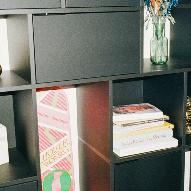
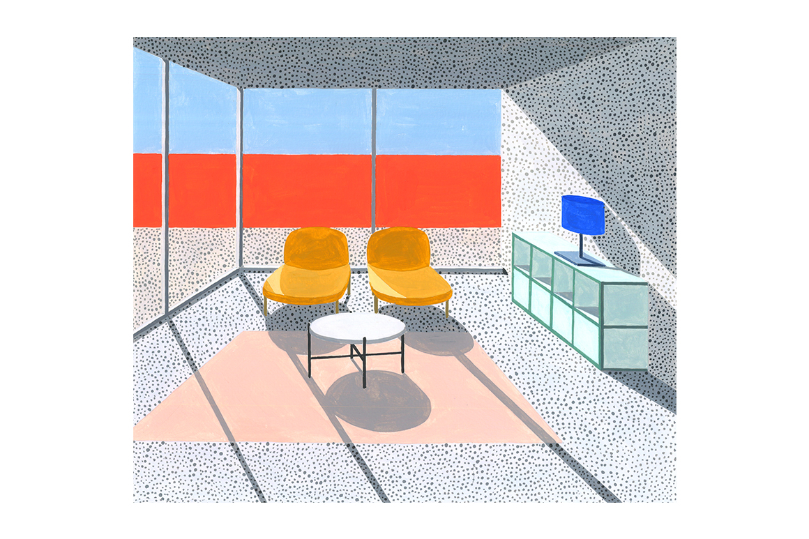
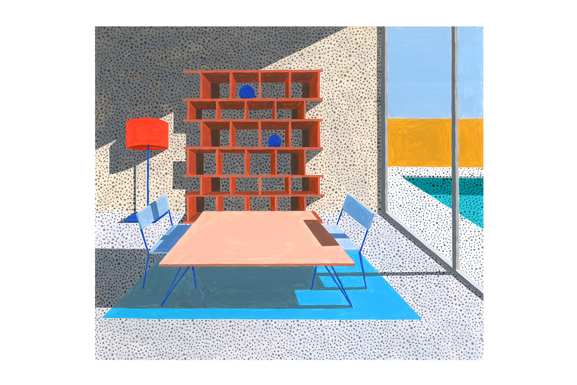
Ana’s work is instantly recognisable and impossible to resist, a combination of visible brushstrokes and carefully placed dot patterns bringing each scene to life. Playing with light and shadow, geometry, realism and surrealism, her sprawling, imaginary homes transport you straight to summertime in Palm Springs. Sun-soaked views bathed in a warm glow, this is utopian living at its best.
Can you tell us a little about your background? How did you get started in the world of illustration?
I was born in Romania but grew up in France. After finishing school I moved to Vienna, Austria, to study printmaking and drawing at the University of Applied Arts. I finished my MFA in 2013 and since 2015 I am working full time as a freelance artist and illustrator. The main focus in my work has always been drawing and so it kind of went naturally into illustration. And also, since I grew up in France surrounded by graphic novels, this was always a direction I wanted to take.
How would you describe your work to someone who was unfamiliar with it?
My work is a combination of clear shapes and colours. I always work with the relation of light and how it influences an image. I paint a lot with acrylics and draw with markers or pencils.
What does an average working day look like for you?
I usually go to the studio in morning and come out in the evening. I take care of administrative parts and then get going with either on-going commissions or bigger paintings I am making.
ON FINDING INSPIRATION
Anything and everything provides inspiration for an artist deeply interested in the world around her, from the strong lines of contemporary comic strip, to a certain light found only on the West Coast of America. It’s all in the detail.
Who or what inspires you?
Many different things but mostly everyday situations. I take a lot of pictures of what I see so I don’t forget small elements that were interesting to me. I am also very fond of graphic novels, French or Japanese ones.
Bright and bold colour is an ongoing theme in your illustrations, what attracts you to such a vivid palette?
For me it is aesthetically fascinating. When light is shining on a bright colour, I am fascinated by the shade part being next to the light part.
What role does light and shadow play in your work?
Light and shadow are at the core of my work. They influence, emphasise and deepen the scenes. Each scene looks different in the morning light or in the evening light. It also adds narrative to the images, something is happening.
ON COLLABORATION
Having worked with some of the best graphic designers, illustrators and animators to help bring our product to life, Ana’s bold and individual aesthetic stood out immediately, her striking interiors the perfect match for the expressive Type02. Just like our shelving, the scope of the brief was without limits. The result? Three incredibly beautiful homes we’d move into in a heartbeat.
How did your collaboration with Tylko come about?
Tylko contacted me in spring for a potential collaboration around their new shelf, the Type02, and I was very interested in working on this! I really like their shelves and their concept and since I was free to set the shelf in scenes that I would choose. It gave me the freedom I really like to have in my work.
You chose three distinct interiors to feature our Tylko shelving, can you tell us about them?
These interiors are all about the communication between the inside and the outside. The harmony between the shapes, the light and colours should also suggest peace of mind and feeling good at home.
ON INTERIORS
Minimalist in decoration, maximalist in colour, Ana uses her rich palette to make a statement while keeping objects to a minimum. A reflection of her own personal tastes: simple, pared back, unfussy, her dream-like environments make the most of light and shade, experimenting with the ways in which both can change texture and pattern.
Have you always been attracted to interiors and furnishings as the subject of your work?
Not always, I used to draw portraits and people a lot. Then I had an abstract phase in which I drew a lot of shapes combined with colours and light. From that it went to painting houses and at one point I thought it would be interesting to represent what is going on inside them rather than their outside.
How would you describe your own interior design style?
Unfortunately I am not sure I have one. I like empty spaces a lot and bookshelves!